
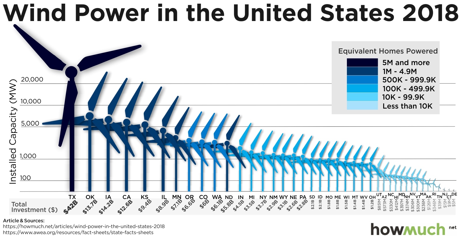
The American Wind Energy Association (AWEA) is a national trade association that advocates for the wind power industry. They also publish data on wind power statistics in the U.S. The authors of this article at howmuch.net got a hold of some of this data and published this unfortunate chart:
REDESIGN THE ABOVE CHART USDING GGPLOT2 LIBRARY IN R
PROJECT QUESTION: Which states are leaders in wind energy?
The answer depends on what you consider a “leader” to be. For example, the authors of the above chart clearly viewed the installed capacity as the most important metric to highlight. But this chart also contains lots of other data, such as the amount of money each state invested, and the number of homes powered by wind in each state. Some states may be leading in other ways, such as the capacity built per dollar of investment.
Loading data
wind_data <- read_excel(here("data_raw","US_State_Wind_Energy_Facts_2018.xlsx"))   # I read the excel file i downloaded and moved it into "data_raw folder"
head(wind_data)        # Chose the head() function to quickly preview the structure and contents of a dataset
#> # A tibble: 6 × 7
#> Ranking State `Installed Capacity (MW)` `Equivalent Homes Powered`
#> <chr> <chr> <dbl> <chr>
#> 1 1.0 TEXAS 23262 6235000.0
#> 2 2.0 OKLAHOMA 7495 2268000.0
#> 3 3.0 IOWA 7312 1935000.0
#> 4 4.0 CALIFORNIA 5686 1298000.0
#> 5 5.0 KANSAS 5110 1719000.0
#> 6 6.0 ILLINOIS 4464 1050000.0
#> # ℹ 3 more variables: `Total Investment ($ Millions)` <chr>,
#> # `Wind Projects Online` <dbl>, `# of Wind Turbines` <chr>slicing Rows
main_data <- wind_data %>%
  slice_head(n = 41)  # Noticed the last 10 rows had NA values for most of the valuables therefore, i selected only the first 41 rows.
head(main_data)
#> # A tibble: 6 × 7
#> Ranking State `Installed Capacity (MW)` `Equivalent Homes Powered`
#> <chr> <chr> <dbl> <chr>
#> 1 1.0 TEXAS 23262 6235000.0
#> 2 2.0 OKLAHOMA 7495 2268000.0
#> 3 3.0 IOWA 7312 1935000.0
#> 4 4.0 CALIFORNIA 5686 1298000.0
#> 5 5.0 KANSAS 5110 1719000.0
#> 6 6.0 ILLINOIS 4464 1050000.0
#> # ℹ 3 more variables: `Total Investment ($ Millions)` <chr>,
#> # `Wind Projects Online` <dbl>, `# of Wind Turbines` <chr>Quick plot to preview the data
# scatter plot
scatter_plot <- ggplot(data = main_data, aes(x = reorder(State, -`Installed Capacity (MW)`), y = `Installed Capacity (MW)`)) +
  geom_point(color = "skyblue", size = 4) +
  coord_flip() +
  labs(
    title = "Installed Wind Power Capacity by State (2018)",
    x = "State",
    y = "Installed Capacity (MW)"
  ) +
  theme_minimal()

print(scatter_plot)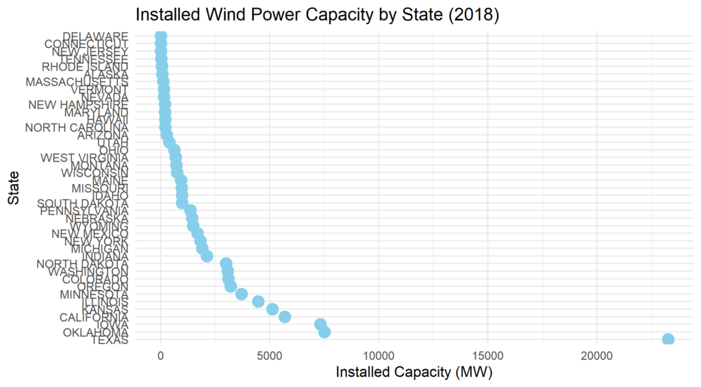
Data cleaning
main_data <- main_data %>%
  clean_names() # i applied the  clean_names() function from the janitor package to modify the daframe

#view(main_data)
head(main_data)
#> # A tibble: 6 × 7
#> ranking state installed_capacity_mw equivalent_homes_powered
#> <chr> <chr> <dbl> <chr>
#> 1 1.0 TEXAS 23262 6235000.0
#> 2 2.0 OKLAHOMA 7495 2268000.0
#> 3 3.0 IOWA 7312 1935000.0
#> 4 4.0 CALIFORNIA 5686 1298000.0
#> 5 5.0 KANSAS 5110 1719000.0
#> 6 6.0 ILLINOIS 4464 1050000.0
#> # ℹ 3 more variables: total_investment_millions <chr>,
#> # wind_projects_online <dbl>, number_of_wind_turbines <chr>Modify variable types and format the total investment column
modified_wind_data <- main_data %>%
  mutate(
    ranking = as.integer(ranking),
    installed_capacity_mw = as.double(installed_capacity_mw),
    equivalent_homes_powered = as.double(equivalent_homes_powered),
    total_investment_millions = as.double(total_investment_millions),
   # total_investment_millions = paste0("$", total_investment_millions),
    wind_projects_online = as.integer(wind_projects_online),
    number_of_wind_turbines = as.double(number_of_wind_turbines)
  )


#view(modified_wind_data)
head(modified_wind_data)
#> # A tibble: 6 × 7
#> ranking state installed_capacity_mw equivalent_homes_powered
#> <int> <chr> <dbl> <dbl>
#> 1 1 TEXAS 23262 6235000
#> 2 2 OKLAHOMA 7495 2268000
#> 3 3 IOWA 7312 1935000
#> 4 4 CALIFORNIA 5686 1298000
#> 5 5 KANSAS 5110 1719000
#> 6 6 ILLINOIS 4464 1050000
#> # ℹ 3 more variables: total_investment_millions <dbl>,
#> # wind_projects_online <int>, number_of_wind_turbines <dbl>Summary of Measures
Create new variables
data <- modified_wind_data %>%
  mutate(
    capacity_per_dollar = installed_capacity_mw / total_investment_millions,
    capacity_per_turbine = installed_capacity_mw / number_of_wind_turbines)

# Summary statistics calculation
summary_stats <- data %>%
  summarise(
    mean_installed_capacity = mean(installed_capacity_mw, na.rm = TRUE),
    sd_installed_capacity = sd(installed_capacity_mw, na.rm = TRUE),
    mean_total_investment = mean(total_investment_millions, na.rm = TRUE),
    sd_total_investment = sd(total_investment_millions, na.rm = TRUE),
    mean_capacity_per_dollar = mean(capacity_per_dollar, na.rm = TRUE),
    sd_capacity_per_dollar = sd(capacity_per_dollar, na.rm = TRUE),
    mean_capacity_per_turbine = mean(capacity_per_turbine, na.rm = TRUE),
    sd_capacity_per_turbine = sd(capacity_per_turbine, na.rm = TRUE)
 )

print(summary_stats)
#> # A tibble: 1 × 8
#> mean_installed_capacity sd_installed_capacity mean_total_investment
#> <dbl> <dbl> <dbl>
#> 1 2192. 3907. 4222.
#> # ℹ 5 more variables: sd_total_investment <dbl>,
#> # mean_capacity_per_dollar <dbl>, sd_capacity_per_dollar <dbl>,
#> # mean_capacity_per_turbine <dbl>, sd_capacity_per_turbine <dbl>Reshaping the summary_stats into vertical order to make it easy to read on a smaller screen
library(tidyr)

summary_stats_long <- summary_stats %>%
  pivot_longer(cols = everything(),
               names_to = "Statistic",
               values_to = "Value")


print(summary_stats_long)
#> # A tibble: 8 × 2
#> Statistic Value
#> <chr> <dbl>
#> 1 mean_installed_capacity 2192.
#> 2 sd_installed_capacity 3907.
#> 3 mean_total_investment 4222.
#> 4 sd_total_investment 7165.
#> 5 mean_capacity_per_dollar 0.505
#> 6 sd_capacity_per_dollar 0.0788
#> 7 mean_capacity_per_turbine 1.77
#> 8 sd_capacity_per_turbine 0.353Installed Capacity (MW):
- The mean installed capacity is2,192 MW, with a high standard deviation (3,907 MW), indicating significant variability across states.
- The maximum capacity is 23,262 MW (Texas), and the minimum is 2 MW.
Total Investment (in millions)
- States have an average investment of $4.2 billion, ranging from $5 million to $42 billion.
- A wide standard deviation ($7.16 billion) indeciates considerable differences in investment levels.
Capacity per Dollar Invested:
- On average, states achieve 0.505 MW of capacity per million dollars invested.
- The values range from 0.156 to 0.744 MW/million, with a relatively narrow spread (standard deviation: 0.079).
Capacity per Turbine:
- The mean capacity per turbine is 1.77 MW, ranging from 0.60 to 2.47 MW.
- Most states have capacity values clustering around 1.67–1.91 MW, suggesting efficiency improvements in turbine output.
Insights:
–Leaders in Wind Energy: States like Texas, Iowa, and Oklahoma lead in installed capacity and have high investments and turbine efficiency. Texas, for instance, demonstrates not only high capacity but also efficient investment and turbine utilization.
- Efficiency Metrics: Capacity per dollar and capacity per turbine provide insight into how effectively states deploy resources. States with higher values in these metrics may serve as models of efficient wind energy development.
Visualization
Visualization 1: Leadership in Installed Capacity (MW)
# Sort the data by installed capacity
data_sorted_capacity <- data %>%
  arrange(desc(installed_capacity_mw))

# Bar plot for Installed Capacity
ggplot(data_sorted_capacity, aes(x = reorder(state, installed_capacity_mw), y = installed_capacity_mw)) +
  geom_bar(stat = "identity", fill = "steelblue") +
  coord_flip() +
  labs(
    title = "Leadership in Installed Wind Power Capacity (MW)",
    x = "State",
    y = "Installed Capacity (MW)"
  ) +
  theme_minimal(base_size = 8)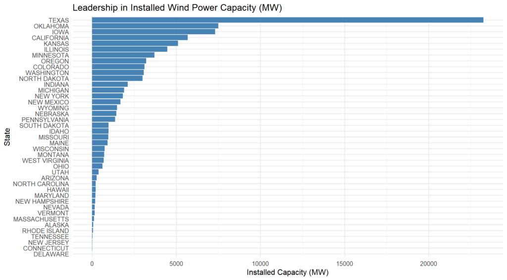
This bar chart visualizes the leadership in installed wind power capacity across U.S. states. Texas clearly leads, followed by Oklahoma and Iowa, highlighting the significant disparity in wind energy capacity among the states.
Visualization 2: Leadership in Total Investment (Millions of USD)
data$total_investment_millions <- as.numeric(gsub("\\$", "", gsub(",", "", data$total_investment_millions))) # Converted the total_investment_millions column to numeric


data_sorted_investment <- data %>%
  arrange(desc(total_investment_millions))# Sort the data by total investment


# Bar plot for Total Investment

ggplot(data_sorted_investment, aes(x = reorder(state, total_investment_millions), y = total_investment_millions)) +
  geom_bar(stat = "identity", fill = "forestgreen") +
  coord_flip() +
  labs(
    title = "Leadership in Total Investment in Wind Power (Millions of USD)",
    x = "State",
    y = "Total Investment (Millions USD)"
  ) +
  theme_minimal(base_size = 8)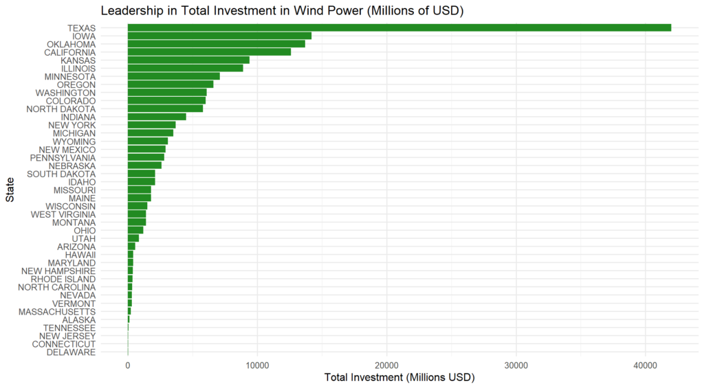
This second visualization shows leadership in total financial investment in wind energy. Texas leads by a significant margin, reflecting its dominance in both installed capacity and financial commitment. Iowa, Oklahoma, and California follow, showcasing their dedication to wind power development.
Summarize your analysis
1. Issues with the Original Chart
The original chart attempted to show leadership in wind energy by displaying state-level data for installed capacity. However, it had several issues that violated key design principles:
- Visual Clutter: The wind turbine icons for each state created unnecessary visual noise, making the chart harder to interpret at a glance. The proportional scaling of the icons added further complexity.
- Misleading Use of Color: The color gradient for “equivalent homes powered” was secondary to the primary message (installed capacity) and competed for attention, diluting the focus.
- Overcrowded Design: Including every state and various metrics (e.g., equivalent homes powered, investments) in one chart overwhelmed the audience and lacked clarity.
- Lack of Hierarchy: The chart failed to prioritize information, leaving viewers unclear about the most important takeaway (leadership in installed capacity).
2. Improvements in the First Revised Chart
The first revised chart focused exclusively on installed capacity (MW) to clearly highlight leadership in this metric. Key improvements include:
- Simplicity: Replacing the turbine icons with a standard bar chart removes visual clutter, making the data more accessible.
- Sorted Data: States are ordered by installed capacity, allowing for quick identification of top performers (e.g., Texas, Oklahoma, Iowa).
- Consistent Color Palette: A single gradient of blue emphasizes the data without distractions, maintaining focus on installed capacity.
- Clear Labels: State names are on the y-axis and capacity values on the x-axis, making it easy to read and compare.
- Elimination of Unnecessary Metrics: The chart excludes “equivalent homes powered” and “total investment,” ensuring a singular focus on installed capacity.
The revised chart effectively conveys that Texas dominates in installed capacity, followed by Oklahoma and Iowa, without unnecessary distractions
3. Message and Design Choices for the Second Chart
The second chart highlights leadership in total financial investment in wind power. This metric emphasizes economic commitment rather than capacity, presenting a different perspective on state leadership. Key design choices include:
- Sorted Data: States are ordered by total investment, making it easy to identify the leaders (Texas, Iowa, and Oklahoma).
- Focused Metric: Unlike the original chart, this visualization isolates total investment as the primary metric, avoiding confusion with secondary data.
- Color Choice: A green gradient symbolizes financial resources and sustainability, reinforcing the message of economic investment in renewable energy.
- Horizontal Bar Layout: A horizontal bar chart is used to facilitate readability, especially with long state names.
- Clear Title and Labels: The title and axis labels clearly communicate the metric being displayed, ensuring the audience understands the chart at a glance.
The second chart highlights that Texas is not only the leader in installed capacity but also in financial investment, followed by other states that show strong economic support for wind power
Overall Insights from this Analysis
The analysis process demonstrates the importance of focusing on clear, uncluttered visualizations that emphasize a single, key message. By addressing specific flaws in the original chart, the revised visualizations provide a clearer understanding of state leadership in both installed capacity and economic investment, offering complementary perspectives on wind power development in the United States.
 Certification")
")
