
This section of my website is dedicated to a project I’ve been working on as part of the Navigator Transportation Data Science Project (TDSP) — a collaborative initiative by the Northeast Big Data Innovation Hub, National Student Data Corps, and the U.S. Department of Transportation.
The focus of this project is simple, yet powerful: use data to help make roads safer, especially for vulnerable road users like pedestrians and cyclists. Through hands-on analysis of real crash data, I’ve been exploring how things like road type, intersections, lane width, medians, and traffic calming features relate to different types of traffic collisions in New York City.
What’s This Project About?
As a participant in the Navigator TDSP, I had the opportunity to work through a series of guided milestones using tools like Python, Pandas, Seaborn, and Folium in Google Colab. The dataset comes from NYC OpenData’s Motor Vehicle Collisions and includes detailed records of crashes reported by police across the city.
Throughout the project, I dove into:
- Data cleaning and preparation (because raw data is never pretty!)
- Exploratory data analysis to understand patterns and trends
- Visual storytelling using plots and maps to communicate insights clearly
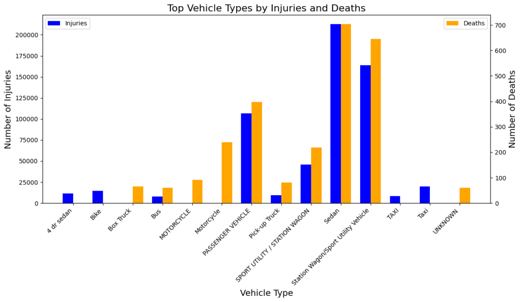
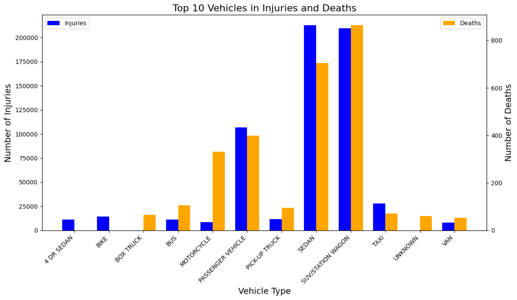
TO DO: What are the top 3 vehicles that were most involved in crashes that resulted in injuries?
- SEDAN
- SUV/STATION WAGON
- PASSANGER VEHICLE
TO DO: Review the top 3 vehicles that were most involved in crashes that resulted in deaths. Do these vehicles differ from those that were most involved in injuries?
- This data reveals that SUVs/Station Wagons have the most fatalities, while Sedans lead in injuries. So yes, there is a difference between vehicles most involved in fatalities versus those most involved in injuries.
TO DO: Why do you think those vehicles are most involved in injury-causing and death-causing crashes?
- SUVs and Station Wagons tend to have higher fatality rates because of their size, rollover risk, and possibly riskier driving behaviors. Sedans, on the other hand, tend to have more injuries due to their widespread use, smaller size, and structural vulnerability in collisions.
TO DO: Are there any recommendations you would make to the Dept. of Transportation based on the data above? Feel free to be creative.
- Lower speed limits in urban areas with high accident rates and install additional traffic-calming measures such as speed bumps, especially on routes frequently used by Sedans and Passenger Vehicles
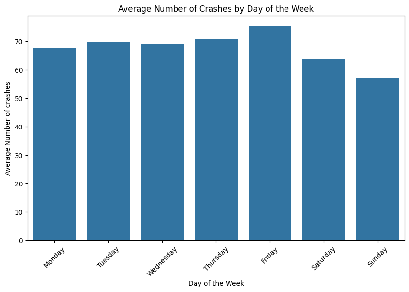
TO DO: Which day of the week sees the most crashes? Why do you think so?
- The day with the most crashes is Friday. (This higher number could be due to increased traffic as people head out for social activities, travel for the weekend, or finish their workweek. Fridays often see more cars on the road, particularly in the evening, leading to a higher risk of accidents.)
TO DO: Which day of the week sees the least crashes? Why do you think so?
- Sunday sees the least crashes. This lower crash rate might be due to less traffic on Sundays, as fewer people commute for work and schools are typically closed. Additionally, people may be more relaxed and in less of a hurry on Sundays, leading to safer driving behavior.
TO DO: Create an ARIMA Model for Time Series forecasting
An ARIMA model, also known as an AutoRegressive Integrated Moving Average model, is a statistical method that allows you to analyze and forecast time series data.
Black Dots: Each black dot represents the actual number of crashes recorded on a given day.
Dark Blue Line: The dark blue line shows the predicted median number of crashes per day. This is the model’s best guess for the central tendency of crashes for future dates.
Light Blue Shaded Area: The light blue shaded area around the dark blue line represents the uncertainty interval of the forecast. The wider this area, the higher the uncertainty. It’s usually narrow close to the last observed data point and widens as you move further into the future, indicating increasing uncertainty in the forecast.
Forecast Period: The forecast itself happens after the last available actual data point. If the graph is not clearly demarcated, you would look for the point where there are no more black dots, and the blue line continues. This continuation beyond the last black dot into the light blue area is the forecasted period.
The graph represents a time series forecasting mondel:
- The shaded area represents the uncertainty intervals around the forecast.
- The forecast seems to continue the recent downward trend in the number of crashes.
- The uncertainty interval grows as the forecast extends further into the future, which is common in time series forecasting due to the compounding of errors.
Spatio-Temporal Analysis
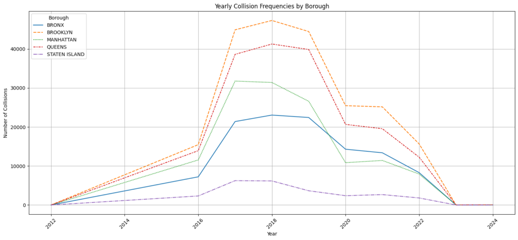
Step 1: Review this resource to read more about Spatio-Temporal Data Analysis. Then, let’s try to create visualizations that demonstrate the spatio-temporal correlation of collisions. Begin by plotting the yearly collision frequencies by borough to see if there are any patterns.
Step 2: Now, let’s analyze the distribution of crashes by month and borough. To do this, we will create a heatmap. To review some of the different types of heatmaps you can create in Python
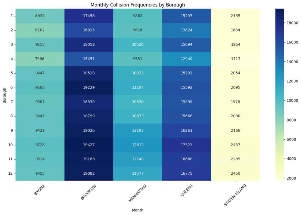
- Brooklyn shows the highest collision frequencies across most months, especially from May to October. This might indicate a higher volume of traffic or road usage patterns that increase collision risks in Brooklyn during these periods.
- Collision frequencies tend to peak around the warmer months (May to October), which could be due to increased travel, tourism, or recreational activities. There is a general trend of higher collisions during these months across all boroughs, particularly in Brooklyn and Queens.
- Staten Island consistently has the lowest collision frequencies throughout the year. This could be due to lower population density, fewer roadways, or less traffic compared to other boroughs.
- Manhattan shows moderate collision frequencies, though its rates are notably high compared to Staten Island. This may reflect the impact of pedestrian traffic, public transport usage, and other non-vehicular factors that might reduce the collision rates compared to Brooklyn and Queens.
- From November to February, collision rates drop slightly in most boroughs, suggesting lower travel activity or perhaps the effect of winter weather discouraging travel.
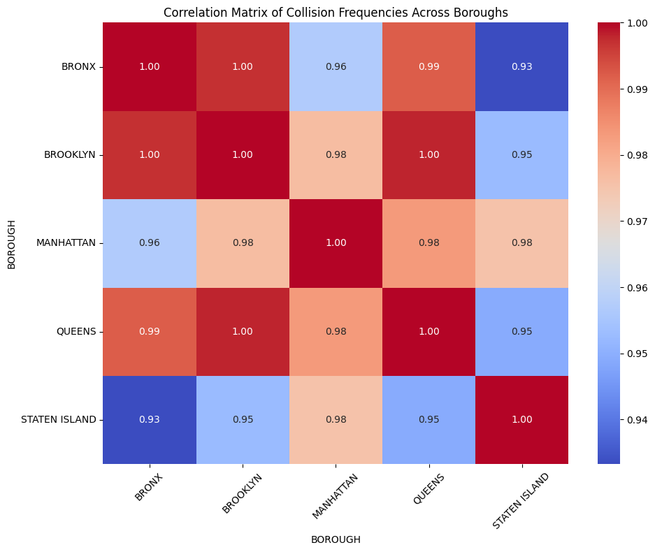
The correlation matrix provides a visual and numerical representation of the relationships between collision frequencies across different boroughs over the years. Values close to 1 indicate a strong positive correlation, meaning that as collisions increase in one borough, they tend to also increase in the other. Values close to -1 indicate a strong negative correlation, and values around 0 suggest no significant correlation.
TO DO: Based on the information above, which boroughs are the most and least correlated?
- Most: Brooklyn and Queens (Correlation = 1.00)
- Least: Bronx and Staten Island (Correlation = 0.71)
TO DO: Why do you think certain boroughs are more correlated than others?
- boroughs with similar population densities, commuting patterns, shared roads, and traffic volumes tend to have higher correlations in collision frequencies, while those with distinct urban layouts, isolated road systems, or different commuting habits (like Staten Island) show lower correlations.
Location Inequality
GOAL: The main goal of this milestone is to think about the implications of this data.
Step 1: Analyze the data to research the following question:
Is there any location inequality in terms of automobile crash rates, pedestrian fatality and injury? What is the relationship between pedestrian fatalities and neighborhood poverty of residence?
TO DO: Write a short explanation of your methods above. Did your research provide you with additional insights? Do you have any new recommendations for DOT FHWA based on your findings?
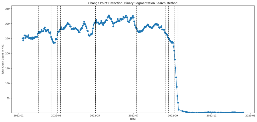
- Using the Binary Segmentation method, I analyzed weekly NYC crash data for 2022 to detect significant changes in crash patterns. Vertical dashed lines in the plot show where crash trends shifted notably.
Key Insights:
- Change points often align with seasonal patterns or external events (e.g., policy changes, holidays).
CCrashes peaked mid-year and dropped sharply in late December.
Recommendations for DOT/FHWA:
- Investigate causes behind each change point.
- Deploy safety measures before expected peaks (e.g., spring/summer).
- Use change detection regularly to assess policy impact.
Potential Interventions
GOAL: The main goal of this milestone is to think about the recommendations and possible interventions that we make offer based on our analysis. You will be given an open-ended question that you may research however you like, as long as it’s approachable and appropriate.
Step 1: Analyze the data to research the following question:
What are potential interventions (e.g., intersection redesign, traffic signal control optimization including adding leading pedestrian intervals, speed limit adjustment) that you would suggest to mitigate collisions between cars and vulnerable road users (VRU)?
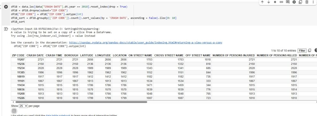
It is unexpected that Manhattan is not the borough with the highest number of crashes. The top collision region in year 2018 is zipcode 11207 in Brooklyn. Within this zipcode area, Broadway and Graham Avenue have the highest density of crashes; however, neither of those two streets has bike lanes.
By viewing the Google Map road configuration, the commonality between these two steets is the lack of, or poor construction of, bike lanes. The street conditions remain to be improved; some bike lanes are either not marked clearly or blocked by trucks or parking vehicles. Due to these facts, we suggest adding new bike lanes to some significant streets which have the first or second highest cycling crash rate in this region
TO DO: Write a short explanation of your methods above. Did your research provide you with additional insights? Do you have any new recommendations for DOT FHWA based on your findings?
- I analyzed NYC crash data from 2018, focusing on ZIP codes with the highest number of collisions. Using Python, I filtered the data, grouped by ZIP code, and identified top crash areas.
ZIP code 11207 in Brooklyn had the most crashes, with major streets lacking bike lanes.
Recommendations:
- Add protected bike lanes in high-crash areas (e.g., 11207).
- Use leading pedestrian intervals at busy intersections.
- Improve street markings and signage.
Research by Emmanuel Agbeko Enyo
 Certification")
")
